
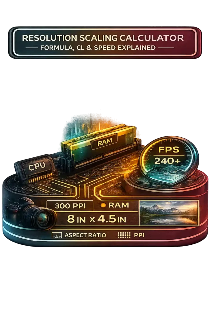
I use this resolution scale calculator when I need to resize an image resolution without messing up the aspect ratio. It helps me upscale resolution or downscale resolution using a simple scaling percentage. The tool keeps framing dimensions correct, so the digital resolution stays proportional and does not stretch or look distorted.
I just enter the original screen resolution and choose a dynamic resolution scale percentage. The calculator adjusts width and height together to maintain the same aspect ratio. For example, scaling 1920×1080 by 125% becomes 2400×1350. The shape stays 16:9, just larger.
It also converts pixels per inch PPI into print size. High quality photo printing uses 300 PPI as the industry standard. Web images usually use 72 to 96 PPI. This helps match image resolution to real print dimensions.
• Printing photos and posters
• Gaming and dynamic resolution scale adjustments
• Video scaling and web optimization
If you’re managing large video projects or multi-drive storage setups, calculate usable RAID capacity using our RAID Calculator. You can also check related tools like a PPI calculator or aspect ratio calculator for more precise adjustments.
How To Use Resolution Scaling Calculator Video
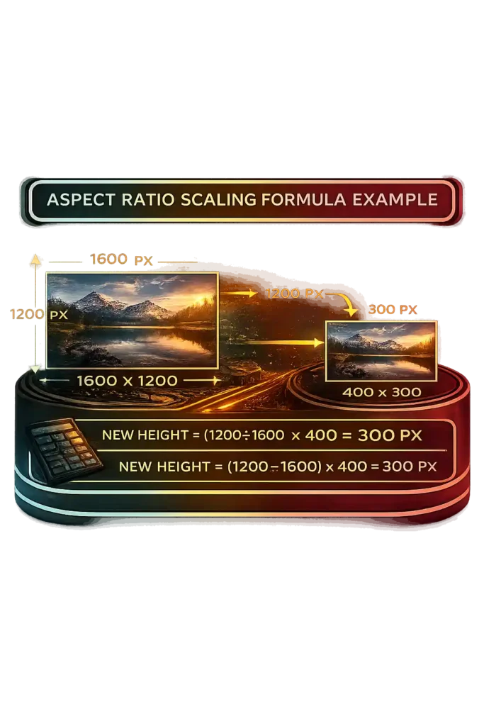
Aspect Ratio Scaling Formula Example
I use the aspect ratio formula when I want to scale image correctly and maintain proportions. This image resizing formula keeps the pixel dimensions balanced so the picture does not stretch.
New height = (Original height ÷ Original width) × New width
Now let me show it step by step.
Original width = 1600
Original height = 1200
New width = 400
New height = (1200 ÷ 1600) × 400
New height = 0.75 × 400
New height = 300 px
So the final size becomes 400 × 300. This same formula works for both upscaling and downscaling. Most editing tools that lock proportions use this exact ratio, which prevents distortion and keeps the aspect ratio correct.
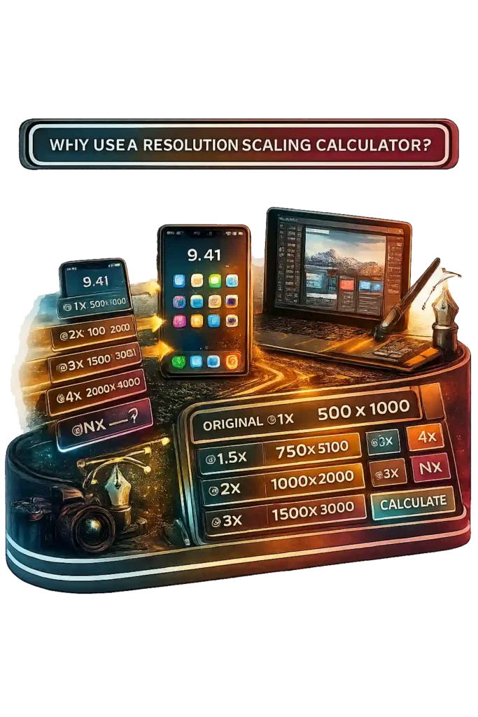
Why Use a Resolution Scaling Calculator
I use a resolution scale calculator when I work on mobile app design or web design scaling. Designers and developers deal with many device resolutions now. Phones, tablets, and laptops all use different pixel density levels. A simple UI scaling mistake can make graphics look blurry. This tool gives instant scaled dimensions so I can prepare assets correctly the first time.
Multi density screens like retina display and high DPI screens need multiple size versions of the same design. Apple introduced Retina displays in 2010, which pushed @2x and higher assets for sharp results. Many Android devices use xxhdpi, which equals about @3x scaling. So I often generate @1x, @1.5x, @2x, @3x, @4x, or even @Nx sizes to match different screens.
Vector graphics scale using math paths, so they stay sharp at any size. Raster images use fixed pixels. If I upscale them, quality drops because interpolation stretches the pixels. That is why raster images should start at a high resolution for proper asset optimization.
Using this calculator keeps my workflow fast and consistent. It improves precision, saves time, and keeps designs sharp across all device resolutions.
Definition and Practical Uses of Resolution Scaling
Resolution scaling changes the render resolution while keeping the display resolution fixed. A monitor has a native resolution, which is its fixed physical pixel grid. For example, a 2560×1440 display contains about 3.7 million pixels. When content runs below native resolution, the system uses interpolation to fill missing pixels. That process affects pixel density and clarity.
Display resolution scaling works differently from image resolution scaling. When you downscale for display, the system renders fewer pixels and stretches them to fit the screen. When you upscale an image, you increase pixel dimensions to match a higher output size. So display scaling often reduces internal pixels for performance, while image scaling usually increases size for layout or print needs.
Image resolution scaling adjusts width and height while maintaining proportions. Higher pixel density improves detail, but stretching low resolution images reduces sharpness. Video resolution scaling follows the same principle, and when working with frame-accurate edits you can convert timeline values precisely using our Timecode to Frame Converter. A 1080p video played on a 4K screen requires upscaling to match the native resolution.
Game resolution scaling changes the internal render resolution to balance gaming performance and visual fidelity. For example, rendering at 1920×1080 on a 2560×1440 monitor reduces pixel load, then the GPU upscales the image to fill the screen. Lower render resolution increases frame rate but can soften detail, and if you want to verify how your display is actually refreshing frames in real time, you can run our Refresh Rate Test. Techniques like anti aliasing and image sharpening help recover clarity.
Modern AI upscaling improves this process. NVIDIA introduced DLSS technology in 2018. DLSS renders frames at a lower internal resolution and uses AI models to upscale them toward near native image quality. This approach increases gaming performance while preserving visual fidelity.
How to Scale a Resolution Using the Resolution Calculator
I use this resolution scale calculator when I want to scale resolution fast without doing manual math. It works like a simple image resizing tool and keeps everything accurate.
- Enter the original resolution. Type the original width and height, like 1920 × 1080.
- Enter the percentage scaling value. Remember, 100% keeps the same size.
- If you increase the percentage, you upscale resolution. If you lower it, you downscale resolution.
- The calculator multiplies both width and height by the percentage. For example, 25% means multiplying by 0.25. So 1920 × 1080 at 25% becomes 960 × 540.
- The result shows the new scaled resolution instantly.
This tool also performs automatic aspect ratio calculation, so the shape never stretches. It includes a resolution scale chart to quickly compare different percentage scaling values for testing or preview use.
How to Determine Resolution Scale Percentage
Resolution scale percentage shows how much the scaled resolution increases or decreases compared to the original resolution. It compares total pixel dimensions, not just width or height. I usually enter the original resolution and the new scaled resolution, and the calculator computes the percentage automatically.
For example, compare 1080p and 1440p. The original resolution is 1920 × 1080. The scaled resolution is 2560 × 1440. Divide 2560 by 1920 and you get 1.333, or 133.3% per dimension. When you account for total pixel count, 1440p has about 77.8% more pixels than 1080p. That equals roughly 177.8% resolution scale percentage. This explains why 1440p vs 1080p feels much sharper.
Windows display scaling percentage works in a similar way. Microsoft documentation shows that 125%, 150%, and 175% scaling adjust logical pixel mapping for high DPI scaling on modern monitors. The physical pixels stay the same, but the interface scales to match pixel density PPI.
This calculator also connects the percentage to physical print size. By combining resolution scale percentage with pixel density PPI, you can estimate real world print dimensions using the dynamic resolution scale chart.
How to Manually Resize a Resolution Using the Formula
Sometimes I do manual resolution scaling when I do not want to use a tool. The resize resolution formula is actually simple. You do not need complex pixel math. Just multiply both dimensions by the same scale percentage.
Formula:
New Width = Original Width × Scale
New Height = Original Height × Scale
Here, “Scale” is the percentage written as a decimal.
50% = 0.5
133.3% = 1.333
Now let me show it clearly.
Take a 1440p resolution, which is 2560 × 1440.
If I downscale resolution to 50%:
2560 × 0.5 = 1280
1440 × 0.5 = 720
The new pixel dimensions become 1280 × 720. The aspect ratio formula stays consistent because both width and height use the same multiplier.
Now let’s upscale resolution.
Start with 1080p resolution, also called FHD, which is 1920 × 1080.
If I apply 133.3% scale:
1920 × 1.333 ≈ 2560
1080 × 1.333 ≈ 1440
That gives 2560 × 1440, which people often call 2K resolution or 1440p resolution.
Here is something important. A 50% reduction does not mean 50% fewer pixels total. Because both width and height are halved, total pixel count becomes 0.5 × 0.5 = 0.25. That means only 25% of the original pixels remain.
For context, 2560 × 1440 contains 3,686,400 pixels.
1920 × 1080 contains 2,073,600 pixels.
So 1440p has about 78% more pixels than 1080p.
Linear scaling changes each dimension equally. Total pixel increase comes from multiplying both sides. Keep the same scale percentage for width and height, and the aspect ratio stays correct every time.
Common Display Resolution Standards for Games, Images and Video
Here is a reference table of common screen resolutions used across gaming resolution, video resolution standards, and digital displays. Many of these formats align with standards published by SMPTE for broadcast and cinema specifications.
| Name | Resolution | Aspect Ratio |
|---|---|---|
| HD (720p) | 1280 × 720 | 16:9 |
| HD Ready | 1366 × 768 | ~16:9 |
| WXGA (768p) | 1280 × 768 | 15:9 |
| WXGA (800p) | 1280 × 800 | 16:10 |
| Full HD (FHD) | 1920 × 1080 | 16:9 |
| WQHD (1440p) | 2560 × 1440 | 16:9 |
| 4K UHD | 3840 × 2160 | 16:9 |
| DCI 4K | 4096 × 2160 | 17:9 |
| 8K UHD | 7680 × 4320 | 16:9 |
HD resolution at 1280 × 720 became an HDTV standard in the early 2000s. Full HD remains the baseline for gaming and streaming. 4K UHD contains 8.29 million pixels, exactly four times the 2.07 million pixels of 1080p. 8K resolution reaches 33.18 million pixels, four times 4K. Consumer adoption of 4K UHD increased rapidly after 2014 as display technology matured.
You can use a resolution scale calculator or print size tool to compare pixel dimensions and physical output sizes across these display resolution standards.
How to Match Pixel Density (PPI) Between Two Displays
Matching pixel density matters when I use dual monitors for design or UI work, and you can compare physical screen size, resolution, and PPI together using our Monitor Size Comparison. If one screen has higher pixels per inch, it looks sharper. The other can look soft next to it. For consistent monitor sharpness and display clarity, both screens should have similar PPI.
PPI Formula Explained
The PPI formula is:
PPI = √(width² + height²) ÷ screen size (in inches)
The square root part calculates diagonal pixels. That gives the total pixel count across the screen’s diagonal. RTINGS explains pixel density using this same formula when comparing display clarity.
Example 1:
1920 × 1080 on a 24 inch monitor
√(1920² + 1080²) = 2202.9
2202.9 ÷ 24 ≈ 91.8 PPI
Example 2:
2560 × 1440 on a 27 inch monitor
√(2560² + 1440²) = 2937
2937 ÷ 27 ≈ 108.8 PPI
Higher pixel density increases perceived sharpness because pixels become smaller and harder to see, and you can calculate exact screen sharpness using our Pixel Density Calculator. At a typical desktop viewing distance of 24 to 30 inches, density above 100 to 110 PPI noticeably reduces visible pixel structure.
Adjusting Resolution to Match Pixel Density
If screen size increases but screen resolution stays the same, pixel density drops. To match the 108.8 PPI of a 27 inch 1440p display on a 32 inch screen, resolution must scale proportionally to about 3200 × 1800. That keeps diagonal pixels balanced with screen size.
DisplayMate research shows that higher pixel density improves clarity and reduces visible pixel structure at normal viewing distance. Apple defines Retina level sharpness as pixels becoming indistinguishable at typical viewing range, often around 220 PPI for laptops.
UI scaling percentage like 125% or 150% changes interface size, but it does not change physical pixels per inch. Only higher diagonal pixels increase true display clarity.
How to Create a Custom Resolution That Matches Screen Scaling
A custom resolution changes the actual pixel dimensions sent to your display. I use this when GPU scaling or multi monitor setups need precise alignment. It is different from display scaling percentage in Windows or macOS. Windows often uses 125%, 150%, or 175% for high DPI scaling, but that only adjusts UI size. It does not change the panel’s native resolution. The native resolution stays fixed because the physical pixel grid does not change.
Calculating Scaled Width and Height
To create a scaled resolution manually, I use this formula:
New Width = Original Width × Scaling %
New Height = Original Height × Scaling %
Convert the percentage to a decimal first.
125% becomes 1.25
75% becomes 0.75
Example 1:
1920 × 1080 at 125%
1920 × 1.25 = 2400
1080 × 1.25 = 1350
Result: 2400 × 1350
Example 2:
2560 × 1440 at 75%
2560 × 0.75 = 1920
1440 × 0.75 = 1080
Result: 1920 × 1080
This keeps proportional pixel dimensions. GPU control panels like NVIDIA or AMD allow entering these custom resolution values directly.
Maintaining Aspect Ratio
Aspect ratio equals width ÷ height.
1920 × 1080 equals 16:9.
If I change 1920 × 1080 to 1920 × 1200, the ratio shifts from 16:9 to 16:10. That creates resolution distortion. To avoid stretching, both dimensions must scale equally.
When aspect ratios do not match, the display adds letterboxing or pillarboxing. Black bars appear because the screen preserves the original image shape instead of distorting it.
Does Running a Monitor at Non Native Resolution Reduce Image Quality?
Yes, it does. A monitor looks sharpest at its native resolution because that matches the panel’s fixed pixel grid. Native resolution means one image pixel maps directly to one physical pixel. A 1920 × 1080 display contains exactly 2,073,600 physical pixels. At native settings, the monitor uses 1:1 pixel mapping, which keeps edges clean and text sharp. Blur Busters explains that LCD panels achieve maximum clarity only when every source pixel aligns perfectly with the display pixel grid.
Why LCD Scaling Causes Blur
LCD panels cannot change their physical pixel grid. When you use a non native resolution, the monitor must scale the image. That process uses interpolation. Interpolation calculates new pixel values between real pixels. Tom’s Hardware notes that this blending causes softness and reduced edge clarity. Text and UI elements look especially blurry because sharp pixel boundaries get averaged. CRT displays behaved differently because they did not rely on a fixed pixel grid. LCD technology depends on exact pixel alignment for monitor sharpness. Scaling artifacts become more visible at close viewing distances and on lower pixel density screens.
Downscaling vs Upscaling
Upscaling stretches a lower resolution to fill a higher resolution screen. This requires interpolation and causes image softness. For example, running 1920 × 1080 on a 2560 × 1440 monitor introduces blur because the pixels do not align evenly.
Downscaling, also called supersampling, renders at a higher resolution and then shrinks to fit the display. AnandTech explains that this process can reduce aliasing and smooth edges. However, fine detail may still average out during scaling. GPU scaling often produces cleaner results than monitor based scaling because the graphics processor uses more advanced filtering.
How Do 16:9 and 16:10 Aspect Ratios Affect Scaling Calculations?
Aspect ratio equals width ÷ height. A 1920 × 1080 display gives 1920 ÷ 1080 = 1.78, which is the aspect ratio 16:9. A 1920 × 1200 display gives 1920 ÷ 1200 = 1.6, which equals aspect ratio 16:10. Both formats follow recognized widescreen standards defined by display industry bodies such as VESA.
16:9 became the global HDTV standard in the early 2000s. It dominates gaming and video content. Aspect ratio 16:10 appears more often in productivity monitors because it provides extra vertical space.
Scaling calculations must preserve pixel proportions. If width and height are not multiplied equally, the ratio changes and distortion appears. Screen resolution scaling always depends on maintaining the original width to height proportion.
Letterboxing and Pillarboxing Explained
When content ratio does not match the display ratio, black bars appear. BBC Research and Development guidance explains that broadcasters preserve the original aspect ratio to avoid stretching images.
Letterboxing adds black bars at the top and bottom. For example, 1920 × 1080 (16:9) shown on a 1920 × 1200 (16:10) display produces horizontal bars because the screen is taller.
Pillarboxing adds black bars on the left and right. For example, 1280 × 800 (16:10) displayed on a 1920 × 1080 (16:9) monitor creates vertical bars.
If scaled proportionally, black bars maintain image accuracy. If stretched to fill, ratio mismatch causes distortion. Ultrawide resolution formats like 21:9, which equal about 2.33:1, increase this effect further. Many gaming engines allow manual aspect ratio selection to prevent stretching and preserve visual accuracy.
What Is the Difference Between Resolution Scaling and OS Display Scaling?
Resolution scaling and OS display scaling are not the same thing. Resolution scaling changes the number of rendered pixels. OS display scaling changes the size of interface elements without changing the physical pixel count. Microsoft High DPI documentation explains that high DPI scaling adjusts logical pixels for readability, while the panel’s native resolution remains fixed.
Render Resolution vs UI Scaling
Render resolution changes true pixel dimensions. If a game drops from 1920 × 1080 to 1280 × 720, the total pixel count falls from 2,073,600 pixels to 921,600 pixels. That is about 55% fewer pixels. Fewer pixels reduce GPU performance load but also reduce image detail and sharpness. Resolution scaling directly affects clarity because it modifies the rendered image itself. This method is common in gaming and video processing.
OS display scaling, often called UI scaling, works differently. A 3840 × 2160 monitor running at 150% Windows scaling still outputs 3840 × 2160 physical pixels. The system enlarges text and interface elements using logical pixels. Windows commonly offers 125%, 150%, and 175% scaling percentages for high resolution displays. The goal is better readability on high DPI screens, not pixel reduction.
Native resolution refers to the display’s fixed physical pixel grid. Render scaling alters image detail and GPU workload. OS scaling changes perceived UI size only. If an application is not DPI aware, the operating system may stretch its interface bitmap, which can introduce blur even though the native resolution does not change.
How Do You Calculate How Large 3:2 Content Appears on a 4:3 Screen?
A 3:2 aspect ratio equals 3 ÷ 2 = 1.5.
A 4:3 screen equals 4 ÷ 3 = 1.33.
Since 1.5 is wider than 1.33, a 3:2 aspect ratio is wider than a 4:3 screen. This screen ratio mismatch creates scaling limits. The goal in aspect ratio scaling is to fit the content without distortion or cropping. Many DSLR photos use 3:2, while older monitors and projectors commonly use 4:3.
Fitting Content Without Cropping
Step one is comparing ratios.
3 ÷ 2 = 1.5
4 ÷ 3 = 1.33
Because 3:2 is wider, width becomes the limiting factor when fitting inside 4:3.
Now use a 4:3 screen resolution of 1024 × 768.
To fit 3:2 content without cropping, start with the full width:
Width = 1024
Height = 1024 ÷ 1.5 = 682.7 ≈ 683
So the fitted resolution becomes 1024 × 683.
Next, calculate unused space:
768 − 683 = 85 pixels total
That leaves about 42 pixels on the top and 42 on the bottom.
This creates letterboxing. The black bars preserve the original width to height ratio.
If you try matching height instead:
768 × 1.5 = 1152 width
That exceeds 1024 pixels, so cropping would occur.
When doing a display scaling calculation, always scale using the dimension that reaches its limit first. This keeps resolution fitting clean and avoids stretching.
How Much Screen Space Does 4:3 Content Occupy on a 16:9 Display?
A 4:3 ratio equals 4 ÷ 3 = 1.33.
A 16:9 ratio equals 16 ÷ 9 = 1.78.
Because 1.33 is smaller than 1.78, 4:3 content is narrower than a 16:9 screen. This aspect ratio mismatch causes pillarboxing when the image fits without cropping. Many classic TV shows and early HD games were created in 4:3. Modern HDTV displays use 16:9, which replaced the older 4:3 broadcast format in the early 2000s.
Calculating Visible Image Area
Start with a common 16:9 resolution of 1920 × 1080.
To fit 4:3 content correctly, match the height first because the content is narrower.
Height = 1080
Width = 1080 × 1.33 ≈ 1436 pixels
So the visible 4:3 image becomes 1436 × 1080.
Now calculate unused horizontal space.
Total width = 1920
Used width = 1436
1920 − 1436 = 484 pixels unused
484 ÷ 2 = 242 pixels on each side
Those black bars on the left and right are called pillarboxing.
Next, calculate screen space percentage.
Visible image area:
1436 × 1080 = 1,550,880 pixels
Full screen area:
1920 × 1080 = 2,073,600 pixels
1,550,880 ÷ 2,073,600 ≈ 74.8%
So 4:3 content uses about 75% of a 16:9 display when scaled properly.
Stretching removes pillarboxing but distorts geometry. Cropping fills the screen but removes image data. Proper resolution scaling math preserves the original aspect ratio.
How Do You Calculate the Visible Screen Area Used by Retro Games?
Retro games often run at very low native resolutions like 256 × 240 or 320 × 240. The NES commonly outputs 256 × 240, and the SNES often uses 256 × 224. Modern displays usually run at 1920 × 1080 or higher. Because of this difference, retro game scaling directly affects visible screen area and sharpness. The scaling method determines whether the image looks crisp or blurry.
Integer vs Fractional Scaling
Integer scaling multiplies the original resolution by whole numbers like 2×, 3×, or 4×. Blur Busters explains that integer scaling preserves pixel perfect scaling because each original pixel becomes an exact square block. No interpolation occurs, so there is no interpolation blur.
Take NES resolution 256 × 240 on a 1920 × 1080 display.
1920 ÷ 256 ≈ 7.5
1080 ÷ 240 = 4.5
The limiting factor is height, so use 4× scaling.
256 × 4 = 1024
240 × 4 = 960
The visible image becomes 1024 × 960.
Remaining vertical space:
1080 − 960 = 120 pixels
That leaves 60 pixels top and bottom, which creates letterboxing.
Remaining horizontal space:
1920 − 1024 = 896 pixels
That leaves 448 pixels on each side, which creates pillarboxing.
Fractional scaling uses non integer values like 4.5×. This fills more screen space but requires interpolation. Interpolation blends pixels together, which reduces pixel sharpness and may cause shimmering.
Integer scaling preserves crisp retro pixel art. Fractional scaling increases visible screen area but sacrifices clarity. Many modern GPUs now include integer scaling modes specifically for retro gaming accuracy.
What Resolution Does 1440p Become at 125% Scaling?
The 1440p resolution, also called QHD resolution, equals 2560 × 1440. When using 125% scaling, you multiply both width and height by 1.25. This creates a new scaled resolution while keeping the aspect ratio 16:9 unchanged.
Example Calculation
Start with the base values:
2560 × 1.25 = 3200
1440 × 1.25 = 1800
The final custom resolution becomes 3200 × 1800.
Now let’s look at pixel count increase.
2560 × 1440 = 3,686,400 pixels
3200 × 1800 = 5,760,000 pixels
That equals about 56% more pixels rendered. Even though each dimension increases by 25%, total pixels grow by 1.25² = 1.5625, or 56.25%.
So 125% screen scaling percentage increases pixel load significantly. The aspect ratio 16:9 remains correct, but GPU workload rises because more pixels must be processed.
Does 125% Scaling Equal 25% More Pixels?
Many people think 125% resolution scale means 25% more pixels. That is not correct. The scaling percentage applies to both width and height, not just one dimension.
Understanding Pixel Area Increase
Resolution scaling math works like this:
Total Pixel Growth = Scale × Scale
So at 125% scaling:
1.25 × 1.25 = 1.5625
That means total rendered pixels increase by 56.25%, not 25%.
Now look at a 1440p scaling example.
Base 1440p resolution:
2560 × 1440 = 3,686,400 pixels
Scaled at 125%:
3200 × 1800 = 5,760,000 pixels
Pixel increase:
5,760,000 − 3,686,400 = 2,073,600 extra pixels
That equals about 56.25% more pixels rendered.
This shows the difference between linear vs area scaling. Width and height grow by 25%, but pixel area grows much more. GPU workload depends on total rendered pixels, which is why performance impact is closer to 56%, not 25%.
How Resolution Scaling Impacts GPU Performance
Resolution scaling directly changes the number of rendered pixels. More pixels mean more GPU fragment shader work per frame. AMD GPUOpen documentation explains that rendering performance scales with pixel workload because each fragment requires shader execution, texture sampling, and memory access. In gaming and real time rendering, higher render resolution increases GPU processing demand and reduces frame rate if the system is GPU bound.
Pixel Count vs GPU Load
The GPU must process every pixel in every frame. Pixel count equals width × height.
1080p resolution:
1920 × 1080 = 2,073,600 pixels
1440p resolution:
2560 × 1440 = 3,686,400 pixels
That is about 78% more pixels than 1080p.
4K resolution:
3840 × 2160 = 8,294,400 pixels
That equals exactly 4× the pixels of 1080p.
NVIDIA GPU Gems explains that doubling resolution in both width and height roughly quadruples pixel workload. This happens because pixel area increases multiplicatively.
More rendered pixels increase fragment shader executions, texture lookups, and memory bandwidth usage. GPU fragment processing scales with total pixel area. When performance is pixel bound, frame rate typically drops close to the inverse of the pixel increase. For example, moving from 1080p to 4K often reduces FPS significantly because the GPU processes four times as many pixels. Higher GPU load can also increase power draw, so confirm safe system wattage using our PSU Wattage Calculator, and estimate long-term energy usage with our Electricity Cost Calculator.
If a game is CPU bound, the impact may be smaller. But in most modern GPU heavy titles, resolution scaling directly determines graphics performance scaling and frame rate impact. To check whether your system is CPU bound or GPU bound at a specific resolution, use our PC Bottleneck Calculator for a full hardware balance analysis. In CPU-bound scenarios, optimizing memory timing can help. You can calculate real memory latency using our RAM Latency Calculator.
Resolution Scale vs FPS Performance Table
Resolution scaling changes total rendered pixels, and GPU performance usually follows pixel count. More pixels increase fragment workload. Fewer pixels reduce render pressure and improve frame rate if the system is GPU bound.
| Base Resolution | Scale % | Render Resolution | Total Pixels | Estimated FPS Change |
|---|---|---|---|---|
| 1920×1080 | 100% | 1920×1080 | 2.07M | Baseline |
| 1920×1080 | 125% | 2400×1350 | 3.24M | -25% FPS |
| 1920×1080 | 150% | 2880×1620 | 4.66M | -40–45% FPS |
| 1920×1080 | 75% | 1440×810 | 1.16M | +35% FPS |
At 125% resolution scale, both width and height increase by 1.25. That raises total pixels by 1.25² = 1.56×, or about 56% more pixel processing. FPS does not always drop exactly 56% because games also depend on CPU load and GPU architecture. For a more precise gaming estimate based on your specific CPU and GPU, try our FPS Calculator.
At 150%, pixel count more than doubles compared to 1080p baseline, which explains the larger performance drop.
When reducing to 75%, total pixels shrink significantly, which reduces GPU fragment processing and often improves FPS noticeably in GPU limited scenarios.
Best Resolution Scale Settings by GPU Tier
Resolution scaling should match GPU performance headroom. Lower tier GPUs struggle with higher pixel counts, while stronger GPUs can handle more aggressive scaling without major FPS drops.
In competitive online games, lowering render resolution can increase FPS, but network latency still affects responsiveness, so it’s smart to verify your connection stability using our Valorant Ping Test before adjusting graphics settings.Since pixel workload increases with total rendered pixels, scaling should reflect graphics performance capacity.
| GPU Tier | 1080p Recommended Scale | 1440p Recommended Scale |
|---|---|---|
| Entry GPU | 80–100% | 70–85% |
| Mid-range | 100–120% | 90–110% |
| High-end | 120–150% | 110–140% |
Entry level GPUs benefit from staying near or below native resolution to maintain stable frame rates. Mid range GPUs typically handle moderate upscale resolution at 1080p but may need balanced scaling at 1440p. High end GPUs can push higher render resolution for improved image clarity, especially in GPU bound games.
Because resolution scaling increases pixel count multiplicatively, moving from 100% to 120% already raises total pixels by 44%. Selecting scale percentage should always consider GPU fragment workload and desired frame rate stability.
FAQ’s
How do I calculate image resolution scale?
I calculate image resolution scale by dividing the scaled resolution by the original resolution. Then I multiply by 100 to get the percentage. For example, if an image is 1920×1080 and I scale it to 2400×1350, I divide 2400 ÷ 1920 = 1.25, which equals 125% scale. Always scale width and height equally to maintain the aspect ratio.
What are standard laptop screen resolutions?
Most modern laptops use these standard resolutions:
HD Ready: 1366×768
Full HD (FHD): 1920×1080
WQHD / 2K: 2560×1440
4K UHD: 3840×2160
These resolutions follow common display standards and vary depending on the device type and size.
What is PPI?
PPI stands for pixels per inch. It measures pixel density on a screen. Higher PPI means sharper images and text because pixels are packed closer together. For example, a 24-inch 1080p monitor has about 92 PPI, while a 27-inch 1440p monitor has about 109 PPI. Matching PPI across displays ensures consistent sharpness.
What is resolution scale?
Resolution scale shows how much a screen or image is upscaled or downscaled relative to its original resolution. For instance, 125% resolution scale increases width and height by 25%, giving more pixels and sharper detail. A lower scale reduces pixel count, improving performance but softening visuals.
What is the percentage scale of 1080p from 1440p?
To find the scale, divide 1440p width by 1080p width: 2560 ÷ 1920 ≈ 1.333. Squaring for total pixel count gives 1.333² ≈ 1.78, or 177.8% resolution scale. This means 1440p has about 78% more pixels than 1080p, which significantly increases GPU workload if rendered natively.